Running Smart with Machine Learning and Strava
An ordered list of your biggest potential training gains, based on sports watch data from you and other athletes.
Running smart?
As a runner always looking to improve my Personal Bests (PBs), I often wonder how I can optimise my time spent running to achieve the best gains whilst being as lazy as possible. Sometimes I run seven times a week, but don’t improve my speeds over a few months. Other times, after weeks spent hiking, drinking and only running once or twice a week, I have run really good PBs. This goes against wisdom from running forums and training plans. Fortunately, I’ve recorded my training for over five years on Strava, and so have many others. There must be a pattern in all this data.
So I built a service to pull data from Strava, the athlete’s social network, with the permission of other athletes. A machine learning algorithm determines, from all athletes’ data, which factors are most important to improve their running. From this algorithm, it is possible to give athletes an ordered list of training improvements they can make in order to get faster.
This writeup is long.
The problem is not an easy one to solve, and the solution not easy to explain in short, as the overlap between running coaches and machine learning engineers is probably fairly small. For that reason, I’ve put a summary section at the top, and kept each technical section fairly self-contained for those looking into the details. I have explained the entire process, from start to finish, including productionising the ‘product.’
Summary
After obtaining data from multiple runners, I built two models:
- A model which can predict, with up to 89% accuracy (R^2), what time an athlete will run in a race (5k to 42k) based purely on their training programme. In other words determining their pace without using their pace data at all. This model is not always useful to the average runner, because there is lots of correlation involved between how fast you are an how often or far you run. When compared to the model, the average athlete can see how they train relative to the top athletes, but not see how to get there.
- A model which can predict, with only up to 54% accuracy (R^2), how much an athlete will improve based on their training programme. This model is much more useful to runners, because it can show the average runner what to do to get better. However, I feel that I need much more training data to get this to an acceptable 70%.
The entire system is now available in a simple website, where athletes can sign up and gain insights into their training plan [update: I have taken the website down as the system ran through my hosting budget very quickly].
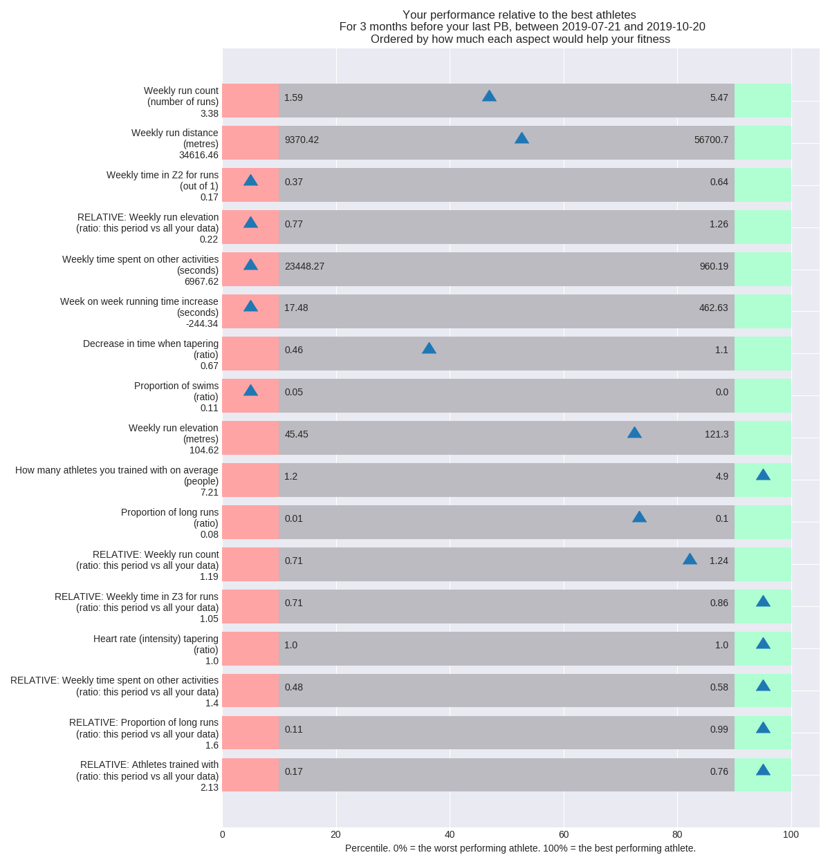
A prototype visualisation for the system output from the first model is shown below. Here, the blue markers show how the athlete trains, relative to the top 10% and bottom 10% of athletes. The list is ordered in order of the most important factors in that athlete’s training, a product of the importance of each factor and the athlete’s shortcoming in it.
Here, it is quite obvious that the athlete needs to run more times per week, and more distance. While doing this, they should spend a lot more time in heart rate zone 2. However, there are some things that they did really well even relative to the best athletes. For instance, for the three months before their PB, they reduced their time spent on non-run activities as they focused harder on running, and they increased the proportion of long runs.
In-depth explanation
From hereon, things get more technical:
Setting some boundaries for the problem
- The Strava API doesn’t return all the data they have (fine-grained heart rate data) or insights. Data returned is averaged per Kilometer, meaning that one can’t look at factors that even out over minutes. For instance, spikes in heart rate or cadence due to really short sprint training programmes cannot be considered.
- This analysis looks at “macro” training initiatives - how you behave over a long period of training. For instance how you structured your weeks, ramped up distance, how easy you took your runs on average. Fortunately, this is one of the hottest problems runners face. Choosing an effective training programme is hard.
- There are MANY ways to tackle this problem, resulting in many model and feature engineering decisions that are more art than science. For instance, I have chosen to only look at factors for a window of three months of training before a Personal Best (PB). There is some science behind the decision, but it could be that it would be more effective to choose two months, or six. Other such decisions included things like setting thresholds for what is considered a “long” run or a “fast” run relative to other runs.
- Many factors that I would love to have are missing. The models will never be perfect, because Garmin and Strava hold their weight, diet, stress and sleep statistics very closely.
- Similarly, the models will do well on average, but may differ in effectiveness per athelte. Some athletes add more noise to the models than others. With more data, this noise will be accounted for in the models. But when it comes to personalised visualisations, the advice will vary: For instance, you may be an extraordinarily fit person who trains perfectly, but need to lose 10kg of upper body muscle to improve.
- Along the same lines, this model is built to be about the average runner. With a much larger dataset, I believe I could run the model on a subset of similar runners in order to deliver runners more relevant advice, for instance showing the bottom 10% of runners how people like them have improved.
Getting technical - first with some running science
The problem I’m solving for here is for distance running: between 5km and 42km. While these are still very different races, the dynamic is similar to the extent that there is a formula and constant variable governing the mapping between an athlete’s speed in any distance in this range. Assuming I regularly run fast (tempo or threshold) runs and long runs around 25km to 30km, it is fairly simple to extrapolate my marathon time from my 5k time. This is done through “vdot,” a constant and formula developed by legendary running coach Jack Daniels. Throughout my model, the assumption is that vdot is an accurate representation of your overall running fitness, and that we are dealing with fitness in the 5-42km distance range.
However, vdot is not a perfect synonymn of fitness, so much as it is a measure of speed. For a holistic measure of fitness, one would have to look at OBLA, V02max, muscle efficiency, and muscle power output versus foot stroke duration. We can’t measure those with wrist watch data. But we can measure what helps people improve the end goal - speed.
Most runners use Strava, a social network for athletes, to upload their data, which is where I am acquiring data from. Strava DOES estimate your fitness (vdot or their own measure) in their own models, but doesn’t make this available through their API. For that reason, the model I built can only extrapolate your fitness when you run a Personal Best (PB), which Strava does make available as “Estimated best efforts.” There were options available, such as estimating fitness from your relation between heart rate and speed, but this would have added too much noise in the model for a Minimum Viable Product (MVP).

To achieve these best efforts, it is generally accepted that you have to follow a finely-tuned balance between training hard and recovering, as well as keeping your machine oiled through lots of easy runs. The former is defined by what trainingpeaks calls the Impulse-Response model - you put your body under stress, and it responds to this stress by getting stronger. The latter is simply because science has shown that our body makes the most efficient performance gains in the aerobic heart rate zone, which corresponds to a relatively easy running pace in “Zone 2”.
Which brings us to heart rate zones: Coaches and athletes have simplified things for us by defining, based on each athlete’s maximum heart rate, a set of zones or ranges that give us target regions to train in based on our heart rate data. These zones range from Z1 to Z5, from minimum to maximum effort. Many professional athletes train entirely by heart rate zone, rather than by pace, because our hearts are the best indicator of our body’s response to training. The image below gives an indication of zones. Please note that it is relatively bad practice to estimate your heart rate zones based on your age, as this varies greatly based on genetics, rather than fitness. For instance, Chris Froome’s max heart rate is 161, and should be 186 based on this model. Fortunately, Strava does not make this assumption, but determines this over time.
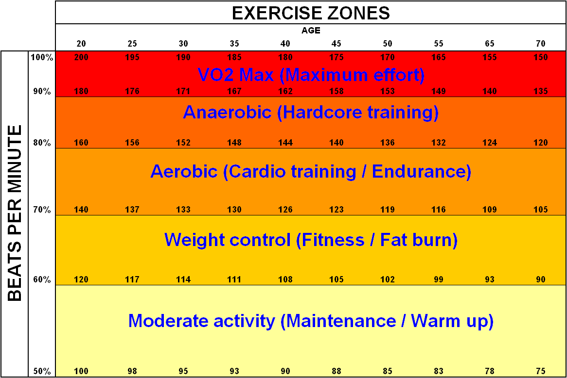
We are capable of spending less time training in higher heart rate zones, but benefit greatly from a bit of time in the higher zones. Different coaches see it differently, general advice is to spend 80% of your time in the “easy” zones Z1-Z3 and 20% in the “hard” zones, Z4 and Z5. However, this also differs depending on whether you are early into your training season, preparing to “peak” for a race, or “tapering” your efforts to be rested for a race.
To manage your time these zones, and further simplify training, coaches advise several types of runs:
- Easy runs
- Long runs
- Interval training
- Tempo runs
- Easy runs with strides or fartleks, quick spurts of pace without too much corresponding heart rate increase
- Any combination of the above.
And if that isn’t enough, there also exists science on how much to increase your mileage per week, a macro-type impulse response model, where your body slowly adapts to more efforts, hence becoming fitter. The price to pay for increasing this too much is of course injury or burnout.
The running science, simplified
Given all of the above, for each athlete, there exists an optimal but very difficult to find balance between
- Easy and hard effort per activity
- Running and resting, depending on your previous activities
- Easy runs, long runs, interval trainings, tempo runs
- Running and cross training
- Increasing your efforts week on week
Without great knowledge yourself, or a coach, it is hard to find this balance, even as a seasoned runner. There are tools available, such as TrainingPeaks’ performance manager and Strava’s premium offering. They are great, especially in how they tell you that you are training too hard and need to rest. However, I find that they all focus on trying to estimate what your current training load is, hence relying on a lot of inaccurate daily heart rate data. I needed something to advise me what I could do differently over a period of months, as opposed to on a day to day basis.
So, as a runner, I built this analysis as a supplementary tool: to tell me what I could do differently over longer periods of months, relative to other athletes.
High level overview of the system
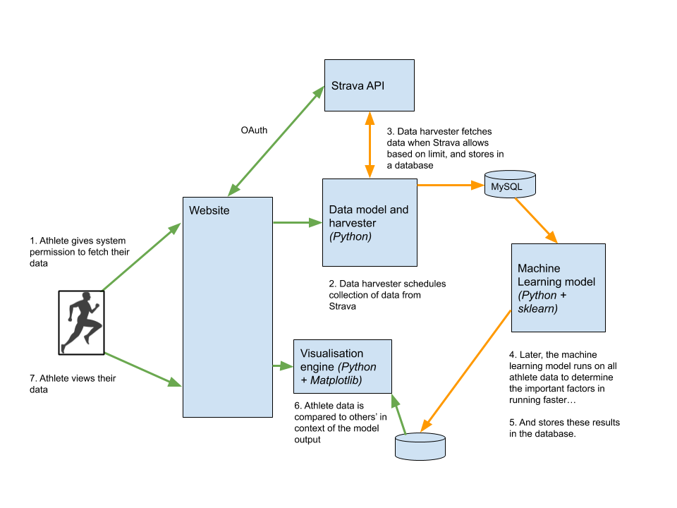
There are several parts to a system like this, that needs to harvest data, train a model, run the model, and produce insights to users in the front end. Once could see them as a system interacting as follows, with green lines indicating synchronous flows and orange lines representing asynchronous flows, due to the time required for API access or processing:
Getting the data: The Strava API
Strava has heavy limitations on their API usage. It cannot be queried without an athlete’s permission, and then is rate limited to allow more or less only 10 runners’ data to be pulled per day. This slows down data harvesting.
Amongst other things, the Strava API provides, per athlete:
- Heart rate zones for the athlete - at which heart rate they experience Z1-Z5
- A list of activities, flagged by their type - whether runs, cycles, or anything the athlete chooses to upload
- For each run, distance, heart rate, pace and ‘laps’ - generally split by km
- For each lap, average heart rate, pace and cadence
- For each run, whether or not it was a ‘best effort’ - in other words, a PB
20 of my friends were kind enough to provide me with all of their data, via Strava. Given that they had an average of 10 PBs in their data each, this provided almost 200 inputs to my models, enough to build an accurate model to estimate vdot, but not enough to build a model to estimate improvement in vdot - a problem that I will explain later.
The data model(s) and feature engineering
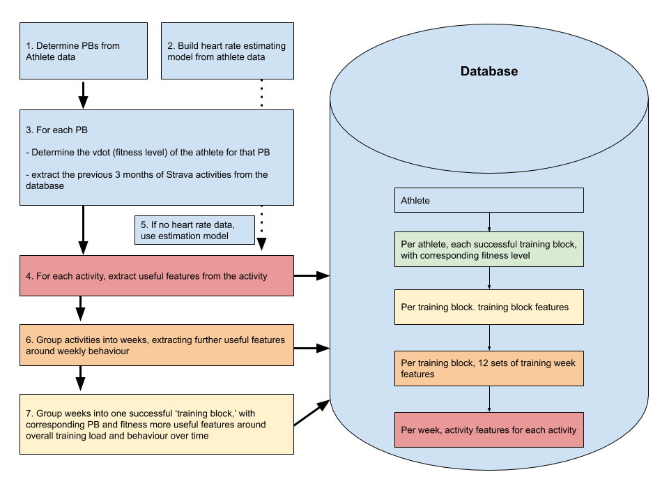
The model used to build up the database to train the machine learning algorithm is shown below.
-
All athlete activities are iterated through, determining which are PBs. For each PB, if it is more than a month after the previous PB, and more than 0.5 vdot over the previous record, becomes a data point. This is to make sure each data point is a standalone PB of sufficient magnitude.
-
From all athlete activities, a regressor is built mapping pace to heart rate for this athlete over one month intervals. This is because a lot of athlete activities were done without heart rate monitors (generally, heart rate monitors have only been used widely in the past two or three years). However, heart rate can still be fairly accurately estimated with this regressor, with R^2 of 0.9. This comes in exceptionally useful in training the machine learning model: it improved R^2 of the overall model by 0.1.
-
For each PB, the vdot of the PB is determined using Jack Daniels’ formula. This is the “y” of the first machine learning model: the feature the model is trained on. For the second model, change in vdot is used, or delta-y. Also for each PB, all activities for 3 months before the PB are extracted. The 3 months was chosen based on relation to R^2 of the final model.
-
For each activity, useful features are extracted, such as type of activity, length, overall effort, etc. Whilst I won’t go too in-depth on model features, things like standard deviation heart of rate is used to determine whether the activity is an interval training session, and relative effort and length of the activity is used to determine whether or not it is a tempo or a long run. Similar logic applies in picking up strides, hill repeats, etc.
-
Especially in the case of activities from several years ago, pace data is used to extrapolate expected heart rate for the activity, to enable some of the above and below features to be extracted from heart rate.
-
Activities are grouped into weeks, a method I am still slightly uncomfortable about, as some athletes might train in cycles of 10 days or 14 days. For each week, more features are extracted such as weekly mileage, split between runs and other activities, and ratios between types of runs.
-
The same is done for grouping weeks into training blocks. Here, the entire three months are considered, and features are more along the lines of relative increases in mileage, efforts, and changes in overall behaviour over the three months. Finally, a taper before the race is also analysed as a factor.
All the above features are stored in the database per PB, per athlete. They are all used to train the final machine learning models. It is important to note that pace is NOT a feature, for obvious reasons.
The machine learning model
This section will be rather underwhelming for machine learning experts. Based on features chosen, the best performing model was a decision tree, closely followed by a vanilla XGBoost. Tweaking these models showed little gains relative to improving the data with some feature engineering, such as extrapolating heart rate from pace where heart rate data wasn’t present.
Intuitively, and based on model performance, the problem is near-linear.
The model is split into two, as mentioned very early on in the article:
-
One model is trained on vdot: determining the features explaining the vdot of an athlete, which is essentially marathon pace. This has an R^2 of 0.89 in the best case, but can go as low as 0.6 depending on the athlete.
-
Another model, the true pot of gold, is trained on change in vdot since the athlete’s last PB. This is much more valuable because it is much less susceptible to correlation and confounding factors. However, here, the best case R^2 is only 0.5.
The features of each (based on my small dataset of n=200) are below. I will update this as the database grows:
Features explaining vdot (fitness)
Here, we have a fairly healthy SHAP plot. Health of this plot in a simple system is usually indicated by a clear separation between red and blue dots.
- Features are all for a 3-month training period before a PB.
- Ordinary features (constants) are prefixed by f_. For instance, f_avg_weekly_run_distance is the average distance (km) run by the athlete.
- Relative features (relative to the rest of this athlete’s data) are prefixed by r_. For instance “r_proportion_yoga” is how much yoga the athlete did for these three months relative to the rest of their training before.
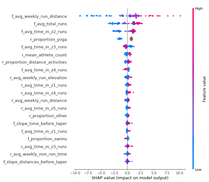
Keep in mind that these features are deemed as important for a non-linear model: a random forest regression algorithm, so we can’t read this as a checklist of important features for runners. I would take some features like “r_proportion_yoga” with a pinch of salt. For instance, the model might have determined that if the athlete doesn’t do much easy running, then their time spent doing yoga is exceptionally important. But since the R^2 of this model is fairly good, and given that we have an almost linear problem, it is safe to look at the features this way, or alternatively run a linear XGBoost feature analysis.
There are several fairly safe conclusions we can make about how fast runners behave before their PBs:
- They run a lot more than slower runners, with more total runs
- They spend more time in heart rate zones 1, 2, 4, and 5, and less time in zone 3. In other words, they either run really easy, or really hard.
- They run with more athletes (r_mean_athlete_count) - definitely correlation here, as they are likely to look towards their main hobby for their social life
- They run more elevation
- … and so on.
Features explaining relative vdot (improvement in fitness)
As a quick recap, rather than looking at what fit athletes do, I trained a model on what athletes, in general, did to improve the most in terms of vdot. This could be an exceptionally powerful analysis with enough data, as it would bring correlation out of the equation. We would see what the average Joe did to get better.
Here, we the SHAP plot is not as healthy. There are many outlying features with high impact on the model.
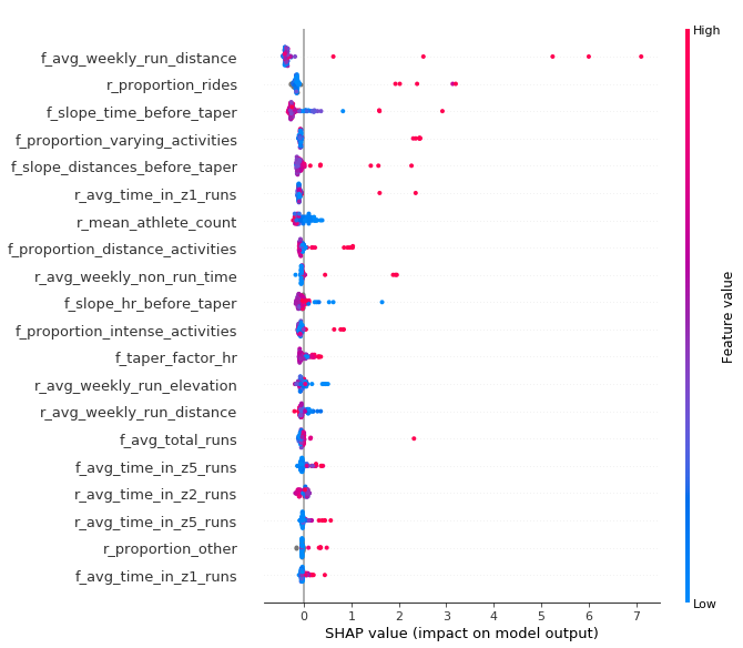
The best R^2 for this model was 0.5. Therefore, with the current dataset size, even for the most explicable athlete performance, it only explains up to 50% of the factors involved in getting faster.
Equally importantly, this model is less linear than the model predicting purely vdot. Some athletes might run PBs by being new to the sport, so the model may decide “Those who run less than 30km per week on average need to have run more than usual to achieve their PB, but those who run more than 120km per week need to run relatively less but run faster.” However, let’s take a look at what an intentional selection of the features say:
- Run. a lot.
- Ride relatively less than before (I live in the Netherlands, as do many of the athletes in the dataset, so it has probably picked up that when we finally stop cycling over our beloved summer, and concentrate on running, we get faster)
- f_slope_time_before_taper: This is an indication of the “ramp up” of time spent exercising before the athlete does their taper. It is deemed important to either ramp things up a lot (for some athletes), or decrease load a little bit (more athletes)
- f_slope_distances_before_taper: Here, there is a fairly clear indication that athletes need to run more distance. So taking this into account with the previous variable, it may be that they need to run less runs, but run further.
- f_proportion_distance_activities: This backs up the previous two points: It is clearly important to run a greater proportion of long runs before running a PB. Keep in mind a potential danger of correlation here - athletes often do a few long runs before intentionally attempting a marathon PB.
Visualisations
So how does this come in useful for an individual? With the above models, it is possible to compare a particular athlete’s training to the ideal. This is shown below, with an explanation on reading the diagram here.
The features are ordered by potential gain: the power of the feature in the model, multiplied by how relatively bad your training was in that aspect. Apart from the obvious “run more” and “run more often,” this model clearly instructs the athlete to “run more in heart rate Z2,” “run more hills” and “swim less.”

Productionising
Productionising at this small scale was fairly straightforward, and I went with an entirely Google Cloud setup. The result is that everything is blazing fast, apart from the Strava API queries which are rate limited at around 1 per second.
- Since the feature engineering and machine learning back-end is run on Python, I went with a Flask front-end
- The solution is hosted on Google Cloud App Engine
- The database is hosted on Google Cloud SQL
- Cron jobs run the feature engineering and ML training algorithms once new athletes subscribe
- Flask queries the back-end to generate matplotlib images when the loads their visualisation pages
What’s next?
There are many improvements that can be made, especially to the visualisations an explanations thereof. However, first, I would like to acquire more data in order to build a better model explaining what it takes to get faster. This more causal model will be infinitely more useful to individual athletes.
